Introduction
This post is part two of a multi-part analysis of college basketball outcomes. Part one showed a couple cool features of R markdown code chunks, and how to use the Kaggle API to download data. If you didn’t see that one, you can find it here.
In this post, I am going to dig into the data set a bit, to understand some of the fields and their relationships with one another. This is going to help me make decisions on how I want to preprocess the data. The end goal is to predict winners of NCAA tournament games. Specifically, this post will look at the following topics.
- dplyr
- ggplot2
- lubridate
- kableExtra
- zoo
- ggthemes
- cowplot
- The 2005 University of Illinois Basketball Team
- The 2005 University of North Carolina Basketball Team
I am from a small town near Champaign, Illinois, so I grew up watching U of I basketball all the time. The 2004-2005 season was definitely my favorite. They made it to the national championship that year, where Sean May and the refs stole a win from the orange and blue (yes, I am still salty 14 years later). With that being said, I am going to explore this data set, specifically from the U of I and UNC perspective.
A Brief Summary of the Data
First, we need to connect to the database that we pulled down and cleaned from part one. Again, if you missed that post, the link is shown above.
base_dir <- '~/ncaa_data'
db_connection <- dbConnect(
      drv = RSQLite::SQLite(),
      dbname = file.path(base_dir, 'database.sqlite')
      )
Using the same methodology from the first post, we can query the data from the SQLite database.
SELECT
    *
FROM
    games
dbDisconnect(db_connection)
rm(db_connection)I like to have my characters as factors, so I am going to convert those now. I also want my Dayzero to be a date field, and my Season to be a factor..
ds <-
  ds %>%
  mutate(Dayzero = mdy(Dayzero), Season = as.factor(Season)) %>%
  mutate_if(is_character, as_factor)

ds %>%
  head(n = 5) %>%
  kable('html') %>%
  kable_styling(
    bootstrap_options = c("striped", "hover")
  ) %>%
scroll_box(width = "100%")| winner | Loser | Season | Dayzero | Daynum | Wscore | Lscore | Wloc | Numot | Wblk | Wfga | Wfga3 | Wfgm | Wfgm3 | Wfta | Wftm | Wdr | Wor | Wast | Wto | Wpf | Lblk | Ldr | Lor | Lfga | Lfga3 | Lfgm | Lfgm3 | Lfta | Lftm | Last | Lto | Lpf | type |
|---|---|---|---|---|---|---|---|---|---|---|---|---|---|---|---|---|---|---|---|---|---|---|---|---|---|---|---|---|---|---|---|---|---|
| Alabama | Oklahoma | 2003 | 2002-11-04 | 10 | 68 | 62 | N | 0 | 1 | 58 | 14 | 27 | 3 | 18 | 11 | 24 | 14 | 13 | 23 | 22 | 2 | 22 | 10 | 53 | 10 | 22 | 2 | 22 | 16 | 8 | 18 | 20 | regular |
| Memphis | Syracuse | 2003 | 2002-11-04 | 10 | 70 | 63 | N | 0 | 4 | 62 | 20 | 26 | 8 | 19 | 10 | 28 | 15 | 16 | 13 | 18 | 6 | 25 | 20 | 67 | 24 | 24 | 6 | 20 | 9 | 7 | 12 | 16 | regular |
| Marquette | Villanova | 2003 | 2002-11-04 | 11 | 73 | 61 | N | 0 | 2 | 58 | 18 | 24 | 8 | 29 | 17 | 26 | 17 | 15 | 10 | 25 | 5 | 22 | 31 | 73 | 26 | 22 | 3 | 23 | 14 | 9 | 12 | 23 | regular |
| N Illinois | Winthrop | 2003 | 2002-11-04 | 11 | 56 | 50 | N | 0 | 2 | 38 | 9 | 18 | 3 | 31 | 17 | 19 | 6 | 11 | 12 | 18 | 3 | 20 | 17 | 49 | 22 | 18 | 6 | 15 | 8 | 9 | 19 | 23 | regular |
| Texas | Georgia | 2003 | 2002-11-04 | 11 | 77 | 71 | N | 0 | 4 | 61 | 14 | 30 | 6 | 13 | 11 | 22 | 17 | 12 | 14 | 20 | 1 | 15 | 21 | 62 | 16 | 24 | 6 | 27 | 17 | 12 | 10 | 14 | regular |
We have data from the season through the - season. Before we pull out UofI and UNC 2005 games, lets look at a summary of some of the fields, starting with the most wins and conversely teams with the most losses.
records <-
  inner_join(
    x =
      ds %>%
      group_by(winner) %>%
      summarize(wins = n()) %>%
      rename(team = winner),
    y =
      ds %>%
      group_by(Loser) %>%
      summarize(losses = n()) %>%
      rename(team = Loser)
  ) %>%
  mutate(win_perc = wins / (wins + losses)) %>%
  arrange(desc(win_perc))

bind_rows(
  records %>% head(5),
  records %>% tail(5)
) %>%
  mutate(
    win_perc = paste0(round(100 * win_perc, 1), '%')
  ) %>%
  rename(
    Team = team,
    Wins = wins,
    Losses = losses,
    `Win Percentage` = win_perc
  ) %>%
  kable('html') %>%
  kable_styling(
    bootstrap_options = c("striped", "hover")
  ) %>%
  group_rows(
    "Top 5 Winning Percentages", 1, 5,
    label_row_css = "background-color: #666; color: #fff;"
  ) %>%
  group_rows(
    "Bottom 5 Winning Percentages", 6, 10,
    label_row_css = "background-color: #666; color: #fff;"
)| Team | Wins | Losses | Win Percentage |
|---|---|---|---|
| Top 5 Winning Percentages | |||
| Kansas | 406 | 90 | 81.9% |
| Duke | 404 | 93 | 81.3% |
| Gonzaga | 376 | 90 | 80.7% |
| Kentucky | 385 | 111 | 77.6% |
| Memphis | 366 | 116 | 75.9% |
| Bottom 5 Winning Percentages | |||
| Longwood | 83 | 261 | 24.1% |
| Abilene Chr | 18 | 58 | 23.7% |
| Cent Arkansas | 62 | 205 | 23.2% |
| MD E Shore | 94 | 321 | 22.7% |
| Morris Brown | 4 | 20 | 16.7% |
This is about what I expected for the top group. I would’ve liked for a Big 10 team to have made the cut. Not a huge Bill Self fan either after the way he left the U of I back in the early 2000s, so I hate seeing Kansas at the top of the list… Before moving on, I just want to get a quick look at the summary of the winning and losing variables.
ds %>%
  select(starts_with('W'), -winner, -Wloc) %>%
  summary() %>%
  kable('html') %>%
  kable_styling(
    bootstrap_options = c("striped", "hover")
  ) %>%
scroll_box(width = "100%") | Wscore | Wblk | Wfga | Wfga3 | Wfgm | Wfgm3 | Wfta | Wftm | Wdr | Wor | Wast | Wto | Wpf | |
|---|---|---|---|---|---|---|---|---|---|---|---|---|---|
| Min. : 34.00 | Min. : 0.00 | Min. : 27.0 | Min. : 1.00 | Min. :10.00 | Min. : 0.000 | Min. : 0.00 | Min. : 0.0 | Min. : 5.00 | Min. : 0.0 | Min. : 1.00 | Min. : 1.0 | Min. : 3.00 | |
| 1st Qu.: 67.00 | 1st Qu.: 2.00 | 1st Qu.: 49.0 | 1st Qu.:14.00 | 1st Qu.:23.00 | 1st Qu.: 5.000 | 1st Qu.:17.00 | 1st Qu.:12.0 | 1st Qu.:22.00 | 1st Qu.: 8.0 | 1st Qu.:12.00 | 1st Qu.:10.0 | 1st Qu.:15.00 | |
| Median : 74.00 | Median : 3.00 | Median : 54.0 | Median :18.00 | Median :26.00 | Median : 7.000 | Median :22.00 | Median :16.0 | Median :25.00 | Median :11.0 | Median :14.00 | Median :13.0 | Median :17.00 | |
| Mean : 74.72 | Mean : 3.84 | Mean : 54.7 | Mean :17.92 | Mean :25.83 | Mean : 6.856 | Mean :22.89 | Mean :16.2 | Mean :25.36 | Mean :11.1 | Mean :14.67 | Mean :13.1 | Mean :17.46 | |
| 3rd Qu.: 82.00 | 3rd Qu.: 5.00 | 3rd Qu.: 59.0 | 3rd Qu.:21.00 | 3rd Qu.:29.00 | 3rd Qu.: 9.000 | 3rd Qu.:28.00 | 3rd Qu.:20.0 | 3rd Qu.:29.00 | 3rd Qu.:14.0 | 3rd Qu.:17.00 | 3rd Qu.:16.0 | 3rd Qu.:20.00 | |
| Max. :144.00 | Max. :21.00 | Max. :103.0 | Max. :56.00 | Max. :56.00 | Max. :25.000 | Max. :67.00 | Max. :48.0 | Max. :50.00 | Max. :38.0 | Max. :40.00 | Max. :33.0 | Max. :41.00 |
ds %>%
  select(starts_with('L'), -Loser) %>%
  summary() %>%
  kable('html') %>%
  kable_styling(
    bootstrap_options = c("striped", "hover")
  ) %>%
scroll_box(width = "100%") | Lscore | Lblk | Ldr | Lor | Lfga | Lfga3 | Lfgm | Lfgm3 | Lfta | Lftm | Last | Lto | Lpf | |
|---|---|---|---|---|---|---|---|---|---|---|---|---|---|
| Min. : 20.00 | Min. : 0.000 | Min. : 4.00 | Min. : 0.00 | Min. : 26.00 | Min. : 1 | Min. : 6.00 | Min. : 0.000 | Min. : 0.0 | Min. : 0.00 | Min. : 0.00 | Min. : 0.00 | Min. : 5.00 | |
| 1st Qu.: 55.00 | 1st Qu.: 1.000 | 1st Qu.:18.00 | 1st Qu.: 8.00 | 1st Qu.: 51.00 | 1st Qu.:15 | 1st Qu.:19.00 | 1st Qu.: 4.000 | 1st Qu.:13.0 | 1st Qu.: 8.00 | 1st Qu.: 9.00 | 1st Qu.:11.00 | 1st Qu.:17.00 | |
| Median : 62.00 | Median : 3.000 | Median :21.00 | Median :11.00 | Median : 56.00 | Median :19 | Median :22.00 | Median : 6.000 | Median :18.0 | Median :12.00 | Median :11.00 | Median :14.00 | Median :20.00 | |
| Mean : 62.76 | Mean : 2.869 | Mean :21.32 | Mean :11.32 | Mean : 55.98 | Mean :19 | Mean :22.35 | Mean : 5.877 | Mean :18.1 | Mean :12.17 | Mean :11.39 | Mean :14.46 | Mean :19.86 | |
| 3rd Qu.: 70.00 | 3rd Qu.: 4.000 | 3rd Qu.:24.00 | 3rd Qu.:14.00 | 3rd Qu.: 61.00 | 3rd Qu.:23 | 3rd Qu.:25.00 | 3rd Qu.: 8.000 | 3rd Qu.:23.0 | 3rd Qu.:16.00 | 3rd Qu.:14.00 | 3rd Qu.:17.00 | 3rd Qu.:23.00 | |
| Max. :140.00 | Max. :18.000 | Max. :45.00 | Max. :36.00 | Max. :106.00 | Max. :54 | Max. :47.00 | Max. :22.000 | Max. :61.0 | Max. :42.00 | Max. :31.00 | Max. :41.00 | Max. :45.00 |
Some of the max values here are crazy. I want to see how a team with 33 turnovers won a game.
ds %>%
  filter(Wto == 33) %>%
  kable('html') %>%
  kable_styling(
    bootstrap_options = c("striped", "hover")
  ) %>%
scroll_box(width = "100%") | winner | Loser | Season | Dayzero | Daynum | Wscore | Lscore | Wloc | Numot | Wblk | Wfga | Wfga3 | Wfgm | Wfgm3 | Wfta | Wftm | Wdr | Wor | Wast | Wto | Wpf | Lblk | Ldr | Lor | Lfga | Lfga3 | Lfgm | Lfgm3 | Lfta | Lftm | Last | Lto | Lpf | type |
|---|---|---|---|---|---|---|---|---|---|---|---|---|---|---|---|---|---|---|---|---|---|---|---|---|---|---|---|---|---|---|---|---|---|
| Morgan St | NC A&T | 2004 | 2003-11-03 | 77 | 76 | 72 | H | 0 | 2 | 47 | 8 | 23 | 5 | 39 | 25 | 23 | 7 | 13 | 33 | 22 | 4 | 15 | 12 | 60 | 22 | 26 | 8 | 20 | 12 | 14 | 31 | 28 | regular |
Well, it helps when the losing team has 31 turnovers… That had to be a rough game to watch.
Analyzing the 2005 National Championship teams
As I mentioned above, I am going to dig into this data set by looking specifically at the university of Illinois and the University of North Carolina for the 2005 season. Step 1, filter the data set to include only relevant data.
UofI <-
  ds %>%
  filter(
    Season == '2005',
    (winner == 'Illinois' | Loser == 'Illinois')
  )

UNC <-
  ds %>%
  filter(
    Season == '2005',
    (winner == 'North Carolina' | Loser == 'North Carolina')
  )


nat_avgs <-
  ds %>%
  mutate(
    fga = Wfga + Lfga,
    fgm = Wfgm + Lfgm,
    fga3 = Wfga3 + Lfga3,
    fgm3 = Wfgm3 + Lfgm3
  ) %>%
  select(fga, fgm, fga3, fgm3) %>%
  summarize(
    fga = sum(fga),
    fgm = sum(fgm),
    fga3 = sum(fga3),
    fgm3 = sum(fgm3)
  ) %>%
  mutate(
    fgperc = fgm / fga,
    fg3perc = fgm3 / fga3
  ) %>%
  select(fgperc, fg3perc)


rm(ds)
The big challenge here is that the data set is oriented at an individual game, base on winners and losers. I want the data to be oriented by the team, so that I can have access to that teams statistics going into that game. The code for this one got pretty long, so I hid that by default, but you can click to open it up on the side.
Doing this gives me the ability to see how the teams were trending over time. For example, I can see the teams score differential as the season progressed, and how it was trending.
UofI %>%
  ggplot(aes(x = id, y = ILL_scorediff)) +
  geom_line(
    size = 1.5,
    alpha = 0.75,
    color = '#E84A27'
  ) +
  geom_smooth(
    size = 1.5,
    alpha = 0.75,
    method = 'lm',
    se = FALSE,
    color = '#13294B'
  ) +
  labs(
    x = 'Game Index',
    y = 'Score Differential',
    title = 'U of I Scoring Differential in 2005',
    subtitle = "They didn't lose very much..."
  ) +
  geom_hline(yintercept = 0, linetype = 2) +
  theme_tufte()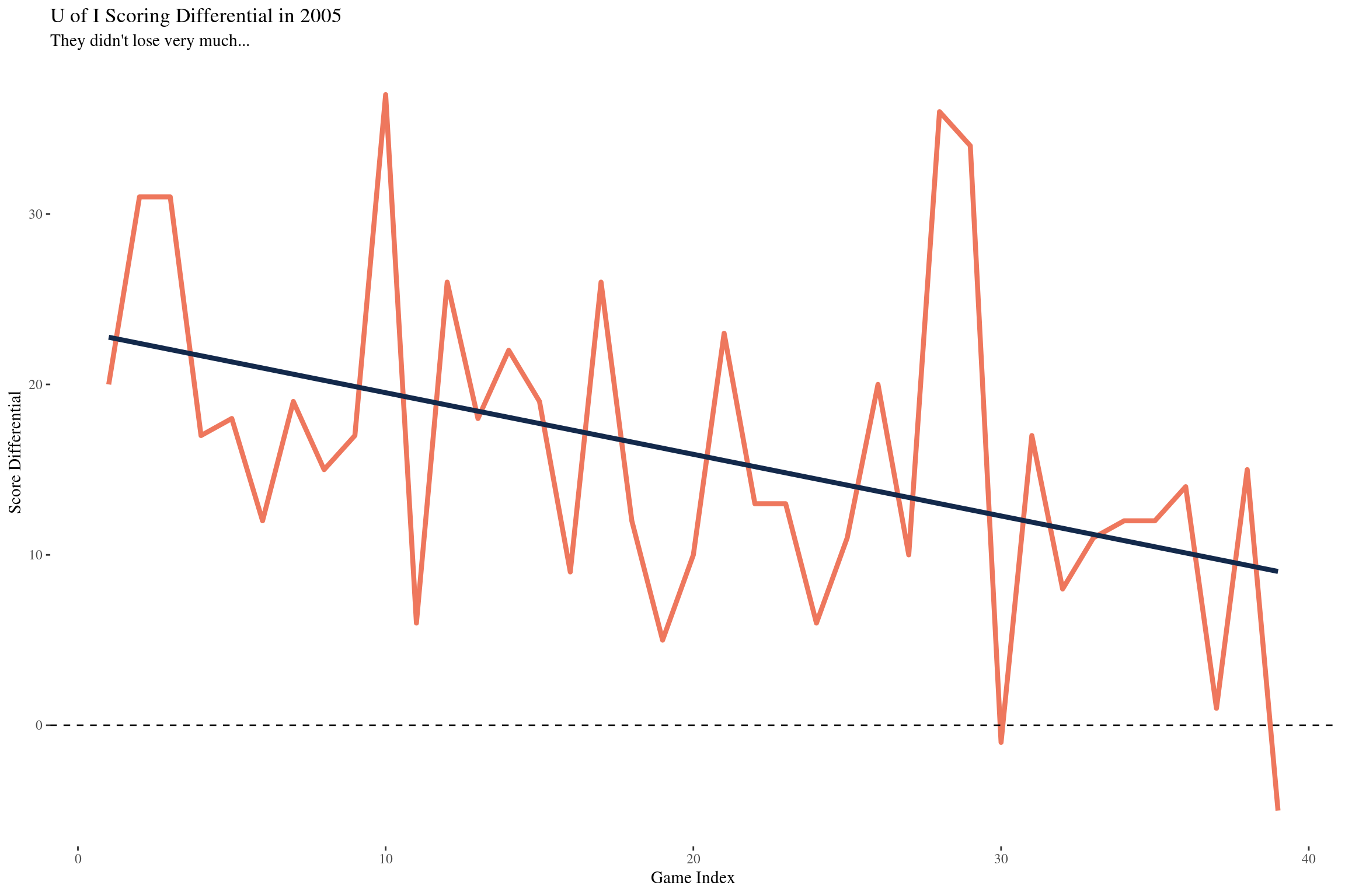
This makes sense, as you get into conference play and tournament time, you start playing tougher competition. With that being said, they were whooping up on teams all throughout the year.
UNC %>%
  ggplot(aes(x = id, y = UNC_scorediff)) +
  geom_line(
    size = 1.5,
    alpha = 0.75,
    color = '#7BAFD4'
  ) +
  geom_smooth(
    size = 1.5,
    alpha = 0.75,
    method = 'lm',
    se = FALSE,
    color = '#13294B'
  ) +
  labs(
    x = 'Game Index',
    y = 'Score Differential',
    title = 'UNC Scoring Differential in 2005'
  ) +
  geom_hline(yintercept = 0, linetype = 2) +
  theme_tufte()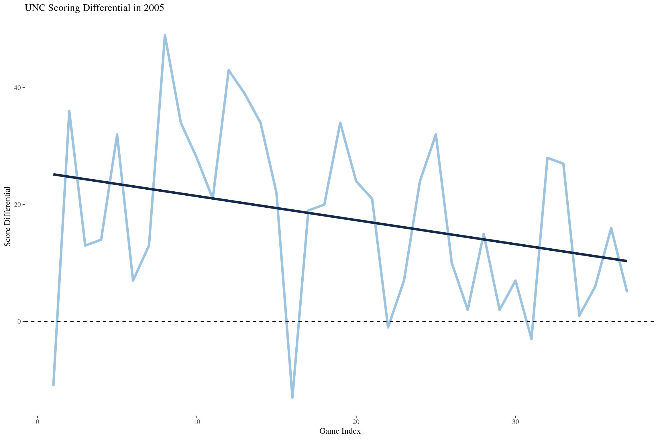
This plot shows a really similar trend which is expected.
UofI_fgs <-
  UofI %>%
  ggplot(aes(x = id)) +
  geom_line(
    aes(y = ILL_fgperc),
    color = '#E84A27',
    size = 1.5,
    alpha = .75
  ) +
  geom_hline(
    yintercept = nat_avgs$fgperc,
    linetype = 2,
    size = 2,
    color = '#13294B'
  ) +
  annotate(
    'text',
    x = 28,
    y = nat_avgs$fgperc + 0.0125,
    color = '#13294B',
    label = paste0('National Avg FG% = ', round(nat_avgs$fgperc, 2))
  ) +
  labs(
    x = 'Game Index',
    y = 'Percentage',
    title = 'ILL 2pt'
  ) +
  theme_tufte()

UofI_fgs3 <-
  UofI %>%
  ggplot(aes(x = id)) +
  geom_line(
    aes(y = ILL_fg3perc),
    color = '#E84A27',
    size = 1.5,
    alpha = .75
  ) +
  geom_hline(
    yintercept = nat_avgs$fg3perc,
    linetype = 2,
    size = 2,
    color = '#13294B'
  ) +
  annotate(
    'text',
    x = 28,
    y = nat_avgs$fg3perc + 0.025,
    color = '#13294B',
    label = paste0('National Avg FG% = ', round(nat_avgs$fg3perc, 2))
  ) +
  labs(
    x = 'Game Index',
    y = 'Percentage',
    title = 'ILL 3pt'
  ) +
  theme_tufte()

UNC_fgs <-
  UNC %>%
  ggplot(aes(x = id)) +
  geom_line(
    aes(y = UNC_fgperc),
    color = '#7BAFD4',
    size = 1.5,
    alpha = .75
  ) +
  geom_hline(
    yintercept = nat_avgs$fgperc,
    linetype = 2,
    size = 2,
    color = '#13294B'
  ) +
  annotate(
    'text',
    x = 26,
    y = nat_avgs$fgperc + 0.02,
    color = '#13294B',
    label = paste0('National Avg FG% = ', round(nat_avgs$fgperc, 2))
  ) +
  labs(
    x = 'Game Index',
    y = 'Percentage',
    title = 'UNC 2pt'
  ) +
  theme_tufte()

UNC_fgs3 <-
  UNC %>%
  ggplot(aes(x = id)) +
  geom_line(
    aes(y = UNC_fg3perc),
    color = '#7BAFD4',
    size = 1.5,
    alpha = .75
  ) +
  geom_hline(
    yintercept = nat_avgs$fg3perc,
    linetype = 2,
    size = 2,
    color = '#13294B'
  ) +
  annotate(
    'text',
    x = 26,
    y = nat_avgs$fg3perc + 0.025,
    color = '#13294B',
    label = paste0('National Avg FG% = ', round(nat_avgs$fg3perc, 2))
  ) +
  labs(
    x = 'Game Index',
    y = 'Percentage',
    title = 'UNC 3pt'
  ) +
  theme_tufte()

plot_grid(
  UofI_fgs, UofI_fgs3, UNC_fgs, UNC_fgs3,
  ncol = 2,
  nrow = 2
)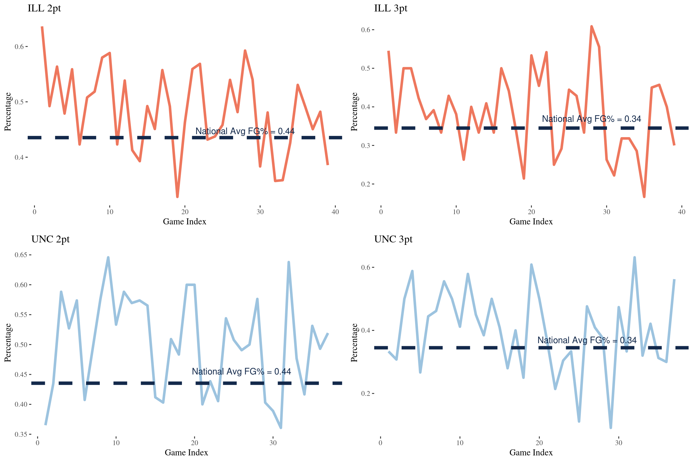
Oddly enough, the U of I shot below the national average on 2 point field goal percentage in the vast majority of games. They definitely seemed to make up for it in their 3 point shooting percentage. A very similar trend shows up on the UNC side of the fence.
UofI_fgs <-
  UofI %>%
  ggplot(aes(x = id)) +
  geom_line(
    aes(y = OPP_fgperc),
    color = '#E84A27',
    size = 1.5,
    alpha = .75
  ) +
  geom_hline(
    yintercept = nat_avgs$fgperc,
    linetype = 2,
    size = 2,
    color = '#13294B'
  ) +
  annotate(
    'text',
    x = 28,
    y = nat_avgs$fgperc + 0.0125,
    color = '#13294B',
    label = paste0('National Avg FG% = ', round(nat_avgs$fgperc, 2))
  ) +
  labs(
    x = 'Game Index',
    y = 'Percentage',
    title = 'ILL Opponent 2pt'
  ) +
  theme_tufte()

UofI_fgs3 <-
  UofI %>%
  ggplot(aes(x = id)) +
  geom_line(
    aes(y = OPP_fg3perc),
    color = '#E84A27',
    size = 1.5,
    alpha = .75
  ) +
  geom_hline(
    yintercept = nat_avgs$fg3perc,
    linetype = 2,
    size = 2,
    color = '#13294B'
  ) +
  annotate(
    'text',
    x = 28,
    y = nat_avgs$fg3perc + 0.025,
    color = '#13294B',
    label = paste0('National Avg FG% = ', round(nat_avgs$fg3perc, 2))
  ) +
  labs(
    x = 'Game Index',
    y = 'Percentage',
    title = 'ILL Opponent 3pt'
  ) +
  theme_tufte()

UNC_fgs <-
  UNC %>%
  ggplot(aes(x = id)) +
  geom_line(
    aes(y = OPP_fgperc),
    color = '#7BAFD4',
    size = 1.5,
    alpha = .75
  ) +
  geom_hline(
    yintercept = nat_avgs$fgperc,
    linetype = 2,
    size = 2,
    color = '#13294B'
  ) +
  annotate(
    'text',
    x = 26,
    y = nat_avgs$fgperc + 0.02,
    color = '#13294B',
    label = paste0('National Avg FG% = ', round(nat_avgs$fgperc, 2))
  ) +
  labs(
    x = 'Game Index',
    y = 'Percentage',
    title = 'UNC Opponent 2pt'
  ) +
  theme_tufte()

UNC_fgs3 <-
  UNC %>%
  ggplot(aes(x = id)) +
  geom_line(
    aes(y = OPP_fg3perc),
    color = '#7BAFD4',
    size = 1.5,
    alpha = .75
  ) +
  geom_hline(
    yintercept = nat_avgs$fg3perc,
    linetype = 2,
    size = 2,
    color = '#13294B'
  ) +
  annotate(
    'text',
    x = 26,
    y = nat_avgs$fg3perc + 0.025,
    color = '#13294B',
    label = paste0('National Avg FG% = ', round(nat_avgs$fg3perc, 2))
  ) +
  labs(
    x = 'Game Index',
    y = 'Percentage',
    title = 'UNC Opponent 3pt'
  ) +
  theme_tufte()

plot_grid(
  UofI_fgs, UofI_fgs3, UNC_fgs, UNC_fgs3,
  ncol = 2,
  nrow = 2
)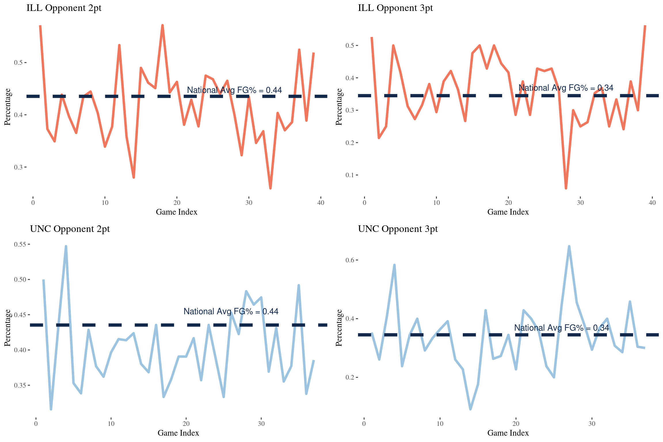
This plot here helps show the strength of UNC’s defense. There were not many games where their opponents shot above the national average in both 2 pointers and 3 pointers.
UofI %>%
  mutate(reb_diff = ILL_ordiff + ILL_drdiff) %>%
  ggplot(aes(x = ILL_astto, y = reb_diff)) +
  geom_point(
    aes(
      size = ILL_scorediff,
      color = type,
      shape = outcome
    ),
    alpha = 0.6
  ) +
  scale_color_manual(
    values = c('#E84A27', '#13294B')
  ) +
  scale_shape_manual(
    values = c(15, 16)
  ) +
  labs(
    x = "Illinois Assist to Turnover Ratio",
    y = "Illinois Rebound Differential",
    title = 'Illinois'
  ) +
  theme_tufte()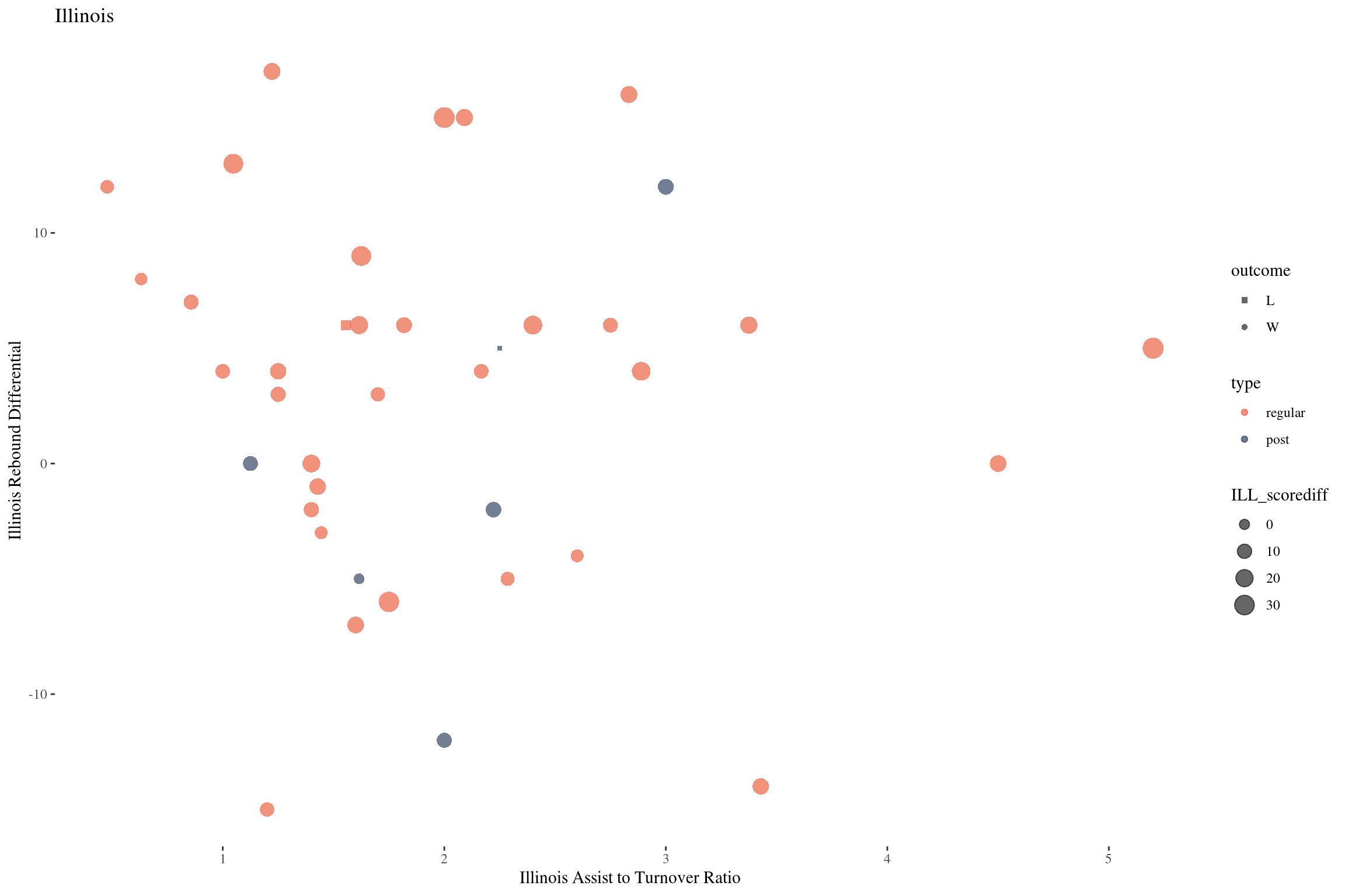
UNC %>%
  mutate(reb_diff = UNC_ordiff + UNC_drdiff) %>%
  ggplot(aes(x = UNC_astto, y = reb_diff)) +
  geom_point(
    aes(
      size = UNC_scorediff,
      color = type,
      shape = outcome
    ),
    alpha = 0.6
  ) +
  scale_color_manual(
    values = c('#7BAFD4', '#13294B')
  ) +
  scale_shape_manual(
    values = c(15, 16)
  ) +
  labs(
    x = "UNC Assist to Turnover Ratio",
    y = "UNC Rebound Differential",
    title = 'UNC'
  ) +
  theme_tufte()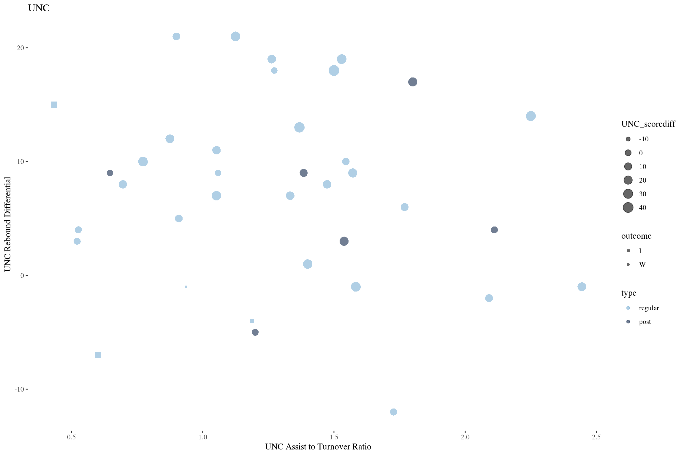
Both of these are pretty interesting to me. It doesn’t seem like the rebound differential has much of an effect on these two teams. They have high point differential on games where they out rebounded there opponents and when they were out rebounded. Assist to turnover ratio seems to be a bit more influential for the Illini. There closer games seem to occur where the assist to turnover ratio is 2 or less. UNC on the other hand seems pretty scattered. This tells me they were a bit more geared towards a 1 on 1 game.
UofI_3gms <-
  UofI %>%
  filter(id == 39) %>%
  select(
    ILL_scorediff_3game,
    ILL_score_3game,
    ILL_fgperc_3game,
    ILL_fg3perc_3game,
    ILL_ftperc_3game,
    ILL_ordiff_3game,
    ILL_ordiff_3game,
    ILL_drdiff_3game,
    ILL_astto_3game
  ) %>%
  mutate(team = 'ILL') %>%
  select(team, everything())
colnames(UofI_3gms) <- colnames(UofI_3gms) %>% str_replace('ILL_', '')

UNC_3gms <-
  UNC %>%
  filter(id == 37) %>%
  select(
    UNC_scorediff_3game,
    UNC_score_3game,
    UNC_fgperc_3game,
    UNC_fg3perc_3game,
    UNC_ftperc_3game,
    UNC_ordiff_3game,
    UNC_ordiff_3game,
    UNC_drdiff_3game,
    UNC_astto_3game
  ) %>%
  mutate(team = 'UNC') %>%
  select(team, everything())
colnames(UNC_3gms) <- colnames(UNC_3gms) %>% str_replace('UNC_', '')

bind_rows(UofI_3gms, UNC_3gms) %>%
 kable('html') %>%
  kable_styling(
    bootstrap_options = c("striped", "hover")
  ) %>%
  add_header_above(c('Last 3 Game Averages' = 9)) %>%
scroll_box(width = "100%") | team | scorediff_3game | score_3game | fgperc_3game | fg3perc_3game | ftperc_3game | ordiff_3game | drdiff_3game | astto_3game |
|---|---|---|---|---|---|---|---|---|
| ILL | 10.000000 | 79.66667 | 0.4746917 | 0.4357143 | 0.7388889 | 0.0000000 | 1.666667 | 2.279202 |
| UNC | 7.666667 | 80.66667 | 0.4802915 | 0.3445175 | 0.7573529 | -0.6666667 | 8.000000 | 1.380928 |
A quick glance at the 3 game statistics coming into the championship seem to be fairly equal between the two teams. The U of I was shooting a bit better from behind the arc and had a better assist to turnover ratio, where as UNC was out rebounding their opponents pretty significantly.
UofI_ship <-
  UofI %>%
  filter(id == 39) %>%
  select(contains('ILL'), -contains('3game')) %>%
  mutate(team = 'ILL') %>%
  select(team, everything())
colnames(UofI_ship) <- colnames(UofI_ship) %>% str_replace('ILL_', '')

UNC_ship <-
  UNC %>%
  filter(id == 37) %>%
  select(contains('UNC'), -contains('3game')) %>%
  mutate(team = 'UNC') %>%
  select(team, everything())
colnames(UNC_ship) <- colnames(UNC_ship) %>% str_replace('UNC_', '')

bind_rows(UofI_ship, UNC_ship) %>%
  kable('html') %>%
  kable_styling(
    bootstrap_options = c("striped", "hover")
  ) %>%
  add_header_above(c('Championship Game' = 21)) %>%
scroll_box(width = "100%") | team | score | fga | fgm | fga3 | fgm3 | fta | ftm | or | dr | ast | to | blk | pf | scorediff | fgperc | fg3perc | ftperc | ordiff | drdiff | astto |
|---|---|---|---|---|---|---|---|---|---|---|---|---|---|---|---|---|---|---|---|---|
| ILL | 70 | 70 | 27 | 40 | 12 | 6 | 4 | 17 | 22 | 18 | 8 | 1 | 18 | -5 | 0.3857143 | 0.3000 | 0.6666667 | 9 | -4 | 2.25 |
| UNC | 75 | 52 | 27 | 16 | 9 | 19 | 12 | 8 | 26 | 12 | 10 | 2 | 13 | 5 | 0.5192308 | 0.5625 | 0.6315789 | -9 | 4 | 1.20 |
Looking at these statistics, its almost shocking that the game was as close as it was. The Illini shooting 39% from 2 and 30% from deep is pretty darn bad, and 56% from 3 with 9 made threes for UNC is crazy. You have to think the 17 offensive rebounds is what kept them in the game, but clearly the shots just weren’t falling.
Moving Forward
The end game of this series of posts is to predict the probability of winning games in the tournament. This exersize was really to get a better understanding of the data set and try to decide how to munge the data set for modeling. The structure of this data set at its input not ideal for modeling and will require a lot of feature engineering. The next post will talk about building this data set. The plan is to create a data set very similar to the UofI and UNC tables in this exploratory analysis.
Well, thanks for reading!